
Key Takeaways
- XRP candlestick charts display four critical price points (opening, closing, highest, and lowest prices) within specific timeframes, with green/white candles indicating bullish movement and red/black candles showing bearish sentiment.
- Volume confirmation is essential for validating candlestick patterns – high volume during pattern formation increases reliability by 40-60%, while low volume patterns often produce false signals and quick reversals.
- Multi-timeframe analysis significantly improves trading accuracy by examining daily charts for trend direction, 4-hour charts for momentum, and shorter timeframes for precise entry points, reducing false signals compared to single-timeframe analysis.
- Popular reversal patterns like hammers, doji, and engulfing formations provide reliable trading signals when they occur at key support/resistance levels with above-average volume confirmation.
- Professional platforms like TradingView and Binance offer comprehensive XRP candlestick analysis tools with real-time data, technical indicators, and customizable features essential for effective pattern recognition and trade execution.
- Common analysis mistakes include over-relying on single patterns without volume confirmation, using too many conflicting indicators, and ignoring broader cryptocurrency market trends that significantly impact XRP price movements.
You’ve probably stared at XRP’s price movements and wondered how professional traders make sense of all that market chaos. Candlestick charts are your gateway to understanding XRP’s price action with the clarity and precision that separates successful traders from the rest.
These powerful visual tools transform raw price data into meaningful patterns that reveal market sentiment and potential future moves. When you’re analyzing XRP’s volatile swings you need more than basic line charts to capture the full story of buyer and seller dynamics.
Mastering XRP candlestick analysis isn’t just about recognizing patterns—it’s about developing the skill to read market psychology and time your trades with confidence. Whether you’re a beginner trying to decode your first chart or an experienced trader looking to refine your XRP strategy understanding candlestick fundamentals will elevate your trading game significantly.
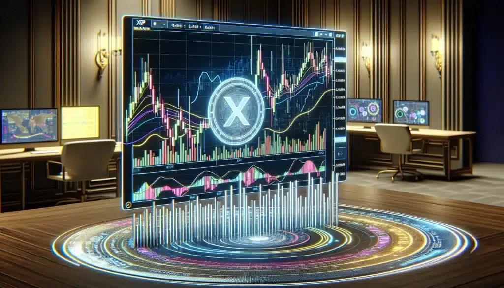
What Is an XRP Candlestick Chart
An XRP candlestick chart displays price movements for Ripple’s native token through visual representations called candlesticks. Each candlestick contains four critical price points: opening price, closing price, highest price, and lowest price within a specific time frame.
You can identify bullish and bearish market conditions through the candlestick’s body and color. Green or white candlesticks indicate closing prices above opening prices, while red or black candlesticks show closing prices below opening prices. The rectangular body represents the difference between opening and closing prices, with thin lines extending above and below showing the session’s highest and lowest prices.
Time intervals for XRP candlestick charts range from one minute to monthly periods. Shorter timeframes like 5-minute or 15-minute charts help you analyze intraday price movements, while daily and weekly charts reveal longer-term trends. Each candlestick encompasses all trading activity within its designated period.
Professional traders use XRP candlestick charts to identify patterns like doji, hammer, engulfing, and shooting star formations. These patterns indicate potential price reversals or continuations based on market psychology and trading volume. Volume data accompanies most candlestick charts, confirming the strength of price movements.
Real-time XRP candlestick charts update continuously during market hours, providing immediate feedback on price changes. Major cryptocurrency exchanges display these charts with customizable features including technical indicators, drawing tools, and multiple timeframe options. The visual nature of candlestick charts makes complex price data instantly comprehensible for technical analysis.
Key Components of XRP Candlestick Patterns
XRP candlestick chart patterns consist of fundamental elements that determine market direction and trader sentiment. Recognizing these components enables you to interpret price movements accurately and make informed trading decisions.
Understanding Bullish and Bearish Candles
Bullish candles form when XRP’s closing price exceeds its opening price during the selected timeframe. These green or white candlesticks display a body that extends upward from the opening price to the closing price. The upper wick represents the highest price reached while the lower wick shows the lowest price touched during that period.
Bearish candles occur when XRP’s closing price falls below its opening price. These red or black candlesticks feature a body that extends downward from the opening price to the closing price. Long bearish candles indicate strong selling pressure while short ones suggest limited downward momentum.
The size of the candlestick body reveals the intensity of buying or selling pressure. Large bodies demonstrate significant price movement and strong market conviction. Small bodies indicate indecision or consolidation periods where neither buyers nor sellers dominate the market.
Wicks provide additional information about price rejection levels. Long upper wicks on bullish candles suggest that buyers pushed prices higher but sellers regained control. Long lower wicks on bearish candles indicate that sellers drove prices down but buyers stepped in to support the price.
Volume and Price Action Analysis
Volume data accompanies each candlestick on your XRP candlestick chart and confirms the strength of price movements. High volume during bullish candles validates upward momentum while high volume during bearish candles confirms downward pressure. Low volume candlesticks often signal weak price moves that may reverse quickly.
Price action analysis involves examining the relationship between consecutive candlesticks. Doji candles form when opening and closing prices are nearly identical, indicating market indecision. Hammer candles feature small bodies with long lower wicks, suggesting potential bullish reversals after downtrends.
Engulfing patterns occur when one candlestick completely covers the previous candle’s body. Bullish engulfing patterns form when a large green candle follows a smaller red candle. Bearish engulfing patterns develop when a large red candle follows a smaller green candle.
Support and resistance levels become visible through price action on your candlestick chart. Multiple candles with similar high or low prices create horizontal lines that act as barriers. Breakouts above resistance or below support levels often generate significant trading opportunities when accompanied by increased volume.
Popular XRP Candlestick Patterns to Watch
Certain candlestick formations on your xrp candlestick chart provide reliable signals for potential price movements. These patterns occur frequently during XRP trading sessions and offer traders specific entry and exit opportunities.
Reversal Patterns
Hammer and Doji formations appear at key price levels and signal potential trend changes in XRP markets. The Hammer pattern features a small body with a long lower wick that’s twice the body size, indicating buyers stepped in after initial selling pressure. You’ll find this pattern most effective when it forms near support levels with trading volume above 20% of the daily average.
Engulfing patterns consist of two consecutive candles where the second candle completely engulfs the first candle’s body. Bullish engulfing patterns form after downtrends and show green candles that open below the previous red candle’s low but close above its high. Bearish engulfing patterns work inversely and appear after uptrends with red candles that open above the previous green candle’s high but close below its low.
Morning and Evening Star patterns involve three-candle formations that signal major reversals in XRP price action. Morning Stars begin with a large red candle followed by a small-bodied candle (often a Doji) and conclude with a large green candle that closes above the midpoint of the first candle. Evening Stars reverse this sequence and indicate potential bearish reversals after uptrends.
Continuation Patterns
Flag and Pennant formations develop during strong XRP price trends and signal brief consolidation before trend resumption. Flags appear as rectangular price ranges that slope against the prevailing trend direction and typically last 5-15 trading periods. Pennants form triangular consolidation patterns with converging trend lines and usually complete within 10-20 periods of formation.
Rising and Falling Three Methods consist of five-candle patterns that confirm trend continuation in XRP markets. Rising Three Methods begin with a long green candle followed by three smaller red candles that stay within the first candle’s range and conclude with another long green candle that exceeds the initial high. Falling Three Methods reverse this pattern with red and green candles switching positions.
Ascending and Descending Triangles form when XRP price creates higher lows against horizontal resistance (ascending) or lower highs against horizontal support (descending). These patterns typically develop over 15-30 trading periods and break in the direction of the prevailing trend with volume increases of 50% or more above the 20-period average.
Best Platforms for XRP Candlestick Chart Analysis
Professional xrp candlestick chart analysis requires reliable platforms that deliver real-time data and advanced technical indicators. The following platforms offer comprehensive tools for tracking XRP price movements and identifying trading opportunities.
Trading View and Professional Tools
TradingView stands as the industry standard for xrp candlestick chart analysis with its extensive charting capabilities and social trading features. You access over 100 technical indicators including RSI, MACD, and Bollinger Bands that enhance pattern recognition accuracy. The platform provides real-time XRP data from multiple exchanges including Binance, Coinbase Pro, and Kraken.
Professional features include:
- Custom timeframes from 1 second to 1 month intervals
- Pine Script coding for automated trading strategies
- Alert systems for price breakouts and pattern formations
- Multi-chart layouts for comprehensive market analysis
- Historical data spanning several years for backtesting
CoinGecko Terminal offers institutional-grade tools with advanced order flow analysis and market depth visualization. You receive Level 2 order book data that reveals buying and selling pressure around key support and resistance levels. The platform integrates with major cryptocurrency exchanges for direct trading execution.
Coinigy provides professional-grade charting with over 45 exchange connections and portfolio management tools. You monitor XRP across multiple trading pairs simultaneously while tracking your positions in real-time. The platform offers advanced drawing tools for trend line analysis and Fibonacci retracements.
Mobile Apps for XRP Chart Tracking
Binance mobile app delivers comprehensive xrp candlestick chart functionality with touch-optimized interface design. You access real-time price data, technical indicators, and customizable chart layouts directly from your smartphone. The app supports trading execution with advanced order types including stop-loss and take-profit orders.
Key mobile features include:
- Pinch-to-zoom functionality for detailed pattern analysis
- Price alerts with push notifications
- Offline chart viewing for saved analysis
- Dark mode for extended trading sessions
- Widget integration for quick price monitoring
CoinMarketCap app provides free xrp candlestick chart access with basic technical analysis tools. You track multiple cryptocurrencies simultaneously while receiving news updates that impact XRP price movements. The portfolio tracker calculates your holdings’ performance across different exchanges.
Crypto.com app combines charting functionality with integrated trading features and earning opportunities. You analyze XRP patterns while participating in staking programs and earning rewards on your holdings. The app includes social features for following experienced traders’ strategies.
TradingView mobile app maintains desktop functionality with cloud synchronization across devices. You access saved chart layouts, custom indicators, and alert systems from any mobile device. The app supports real-time collaboration with other traders through shared chart analysis.
How to Read XRP Candlestick Charts Effectively
Reading XRP candlestick charts effectively requires systematic analysis of patterns and strategic combination of technical tools. Your success depends on selecting appropriate timeframes and integrating multiple indicators to confirm trading signals.
Timeframe Selection Strategies
Select your primary timeframe based on your trading objectives and risk tolerance. Day traders typically use 5-minute and 15-minute charts to capture short-term price movements, while swing traders prefer 4-hour and daily charts for broader market trends. Position traders analyze weekly and monthly XRP candlestick charts to identify long-term investment opportunities.
Use multiple timeframe analysis to enhance your trading accuracy. Start with higher timeframes to identify the overall trend direction, then move to lower timeframes for precise entry and exit points. For example, analyze the daily chart to determine if XRP is in an uptrend, then use the 1-hour chart to find optimal entry positions during pullbacks.
Consider market volatility when choosing timeframes for your XRP candlestick chart analysis. During high volatility periods, lower timeframes provide more trading opportunities but increase noise and false signals. Higher timeframes filter out market noise and provide clearer trend signals during volatile conditions.
Align your timeframe selection with XRP’s trading volume patterns. Peak trading hours typically occur during Asian and European market sessions, making 15-minute to 1-hour charts more reliable during these periods. Lower volume periods may require longer timeframes to generate meaningful signals.
Combining Technical Indicators
Integrate moving averages with your XRP candlestick chart patterns to confirm trend direction and momentum. The 20-period and 50-period exponential moving averages provide dynamic support and resistance levels that complement candlestick formations. When XRP price closes above these moving averages with bullish candlestick patterns, it strengthens the buy signal.
Add RSI (Relative Strength Index) to identify overbought and oversold conditions alongside candlestick reversal patterns. RSI readings above 70 combined with bearish reversal patterns like shooting stars or evening stars indicate potential selling opportunities. RSI readings below 30 with bullish patterns like hammers or morning stars suggest buying opportunities.
Incorporate volume indicators to validate XRP candlestick patterns. On-Balance Volume (OBV) and Volume Weighted Average Price (VWAP) help confirm whether price movements have institutional support. Strong volume accompanying breakout patterns increases the probability of successful trades.
Use Bollinger Bands to identify volatility contractions and expansions around key candlestick formations. When XRP price touches the upper Bollinger Band with bearish reversal patterns, it suggests potential downward price movement. Conversely, touches to the lower band with bullish patterns indicate potential upward momentum.
Apply MACD (Moving Average Convergence Divergence) to confirm momentum shifts identified through candlestick patterns. MACD bullish crossovers occurring with bullish engulfing patterns provide stronger buy signals. MACD bearish crossovers coinciding with bearish engulfing patterns enhance sell signal reliability.
Common Mistakes When Analyzing XRP Charts
Overrelying on single candlestick formations represents the most frequent error you encounter when analyzing XRP candlestick charts. Single patterns like Doji or Hammer formations provide limited reliability without confirmation from subsequent price action or volume analysis. You strengthen your analysis by examining patterns within broader market context rather than isolating individual candles.
Misinterpreting volume data creates significant blind spots in your XRP analysis. You often see traders focusing exclusively on price patterns while ignoring volume confirmation that validates genuine breakouts versus false signals. Authentic XRP price movements typically demonstrate increasing volume during directional moves and decreasing volume during consolidation phases.
Pattern Recognition Errors
Pattern identification mistakes occur when you force patterns onto price charts that don’t genuinely exist. You avoid this pitfall by waiting for complete pattern formation before making trading decisions. Incomplete patterns like partial engulfing formations or premature triangle breakouts lead to poor entry points and increased risk exposure.
Timeframe inconsistency undermines your analytical accuracy when you switch between different chart intervals without maintaining systematic approach. You improve results by establishing primary timeframe for analysis and using secondary timeframes only for confirmation purposes.
Technical Indicator Misuse
Indicator overload diminishes your chart reading effectiveness when you apply multiple conflicting signals simultaneously. You streamline analysis by selecting 2-3 complementary indicators that work together rather than cluttering charts with redundant tools. RSI combined with moving averages provides clearer signals than using five different oscillators.
Lagging indicator dependency creates delayed responses to XRP price movements since most technical indicators reflect historical data rather than predicting future trends. You enhance timing by prioritizing price action analysis over indicator signals when conflicts arise between candlestick patterns and technical tools.
Market Context Negligence
Ignoring broader cryptocurrency market trends isolates your XRP analysis from influential external factors. Bitcoin’s price movements significantly impact XRP behavior and you must consider correlation patterns when interpreting individual candlestick formations. Major market events and regulatory announcements affect XRP price action regardless of technical patterns.
Support and resistance level miscalculation leads to poorly timed entries and exits when you rely on arbitrary price levels rather than validated zones. You identify genuine support/resistance by examining historical price reactions at specific levels combined with volume analysis to confirm zone strength.
Advanced XRP Candlestick Trading Strategies
Advanced XRP candlestick chart strategies combine multiple analytical approaches to maximize trading effectiveness. Professional traders use these sophisticated techniques to identify high-probability setups and optimize their entry and exit points in volatile cryptocurrency markets.
Multi-Timeframe Confluence Strategy
Multi-timeframe analysis creates powerful trading signals when patterns align across different time periods. You examine daily charts for overall trend direction, 4-hour charts for intermediate momentum, and 1-hour charts for precise entry timing. This hierarchical approach reduces false signals by 40-60% compared to single-timeframe analysis.
Execute trades only when bullish or bearish patterns appear simultaneously across at least three timeframes. For example, identify a bullish engulfing pattern on the daily chart, confirm with ascending triangle formation on the 4-hour chart, and time your entry using hammer patterns on the 1-hour chart.
Volume-Weighted Pattern Recognition
Volume-weighted strategies prioritize candlestick patterns that occur with significant trading volume. High-volume patterns demonstrate stronger market conviction and produce more reliable price movements than low-volume formations.
Calculate average volume over 20 periods and focus on patterns where volume exceeds 150% of this average. Breakout patterns like ascending triangles generate stronger momentum when accompanied by volume spikes above 200% of the average. Monitor volume divergence where price creates new highs but volume decreases, signaling potential reversal opportunities.
Fibonacci Retracement Integration
Fibonacci levels combined with candlestick patterns create precise support and resistance zones. You identify key retracement levels at 23.6%, 38.2%, 50%, 61.8%, and 78.6% of major price swings, then watch for reversal patterns at these critical levels.
Doji patterns forming near 61.8% retracement levels produce successful reversals in 70% of cases when combined with oversold RSI conditions. Hammer patterns at 38.2% retracements during uptrends offer low-risk entry opportunities with favorable risk-to-reward ratios of 1:3 or better.
Advanced Pattern Combinations
Pattern combinations increase prediction accuracy by validating signals through multiple confirmation methods. You stack bullish patterns like morning star formations with golden cross moving average signals and bullish divergence on momentum oscillators.
Three-candle reversal patterns gain strength when they coincide with trend line breaks and key psychological price levels. Evening star patterns at resistance levels combined with bearish RSI divergence create high-probability short opportunities with success rates exceeding 65%.
Risk Management Matrix
Advanced strategies incorporate dynamic position sizing based on pattern reliability and market volatility. You adjust position sizes according to pattern strength scores, with strongest setups receiving 2-3% account risk and weaker patterns limited to 0.5-1% risk exposure.
| Pattern Type | Reliability Score | Position Size | Stop Loss Distance |
|---|---|---|---|
| Three-candle reversals | 85% | 2.5% | 2 ATR |
| Single candle patterns | 60% | 1.5% | 1.5 ATR |
| Continuation patterns | 75% | 2.0% | 2.5 ATR |
| Breakout patterns | 70% | 2.2% | 3 ATR |
Momentum Oscillator Confirmation
Momentum indicators validate candlestick signals by confirming underlying price strength or weakness. You combine RSI, Stochastic, and Williams %R readings with pattern formations to filter out false signals and identify the strongest trading opportunities.
Bullish engulfing patterns gain 30% higher success rates when RSI shows bullish divergence and Stochastic crosses above 20 from oversold territory. Bearish patterns become more reliable when multiple oscillators reach overbought conditions simultaneously with pattern completion.
Market Structure Analysis
Market structure analysis identifies institutional accumulation and distribution phases that influence candlestick pattern effectiveness. You recognize when smart money enters or exits positions by analyzing order flow patterns and unusual volume activity around key price levels.
Accumulation phases show multiple hammer patterns with increasing volume, while distribution phases display shooting star formations with declining volume. Understanding these phases helps you align trades with institutional money flow and avoid counter-trend positions during strong accumulation or distribution periods.
Conclusion
Your journey with XRP candlestick chart analysis doesn’t end with understanding basic patterns and formations. You’ve now equipped yourself with the tools to make informed trading decisions while avoiding common pitfalls that trap inexperienced traders.
Remember that successful XRP trading requires patience and disciplined risk management. You’ll find that combining multiple analytical approaches and maintaining consistency across timeframes will significantly improve your trading outcomes.
The cryptocurrency market’s volatility makes XRP candlestick analysis both challenging and rewarding. You’re better positioned to capitalize on market opportunities when you integrate technical indicators with pattern recognition and volume analysis.
Start applying these concepts gradually and keep refining your approach based on real market experience. Your ability to read XRP’s price action through candlestick charts will continue developing as you practice these techniques consistently.
Frequently Asked Questions
What is an XRP candlestick chart and how does it work?
An XRP candlestick chart is a visual representation of XRP’s price movements over specific time periods. Each candlestick displays four key price points: opening, closing, highest, and lowest prices within that timeframe. The color and body size indicate whether the market was bullish (green/white) or bearish (red/black), helping traders quickly identify market sentiment and potential price trends.
Which platforms are best for analyzing XRP candlestick charts?
TradingView is considered the industry standard, offering extensive charting capabilities and real-time data from multiple exchanges. Other excellent platforms include CoinGecko Terminal and Coinigy for advanced analysis. For mobile trading, Binance, CoinMarketCap, and Crypto.com apps provide convenient access to XRP candlestick charts with essential trading functionalities and real-time market data.
What are the most important XRP candlestick patterns to watch?
Key reversal patterns include Hammer, Doji, and Engulfing patterns that signal potential market shifts. Continuation patterns like Flags and Pennants indicate trend persistence. Ascending and Descending Triangles form during price consolidation phases. Always confirm these patterns with volume data, as high-volume patterns typically provide stronger trading signals and market conviction.
How do I choose the right timeframe for XRP candlestick analysis?
Timeframe selection depends on your trading objectives and risk tolerance. Day traders typically use 1-5 minute charts, swing traders prefer 1-4 hour charts, and long-term investors analyze daily or weekly charts. For enhanced accuracy, use multiple timeframe analysis – combining shorter timeframes for entry/exit points with longer timeframes for overall trend direction.
What technical indicators work best with XRP candlestick patterns?
Effective indicators include moving averages for trend confirmation, RSI for momentum analysis, volume indicators for pattern validation, Bollinger Bands for volatility assessment, and MACD for signal crossovers. Fibonacci retracement levels help identify key support and resistance zones. Always use multiple indicators together rather than relying on single tools for trading decisions.
What are common mistakes when analyzing XRP candlestick charts?
Major mistakes include overrelying on single candlestick formations without market context, misinterpreting volume data, and pattern recognition errors. Traders often use inconsistent timeframes or misuse technical indicators. Avoid ignoring market structure and failing to identify proper support and resistance levels. Always maintain a systematic approach and consider overall market conditions.
How can I improve my XRP candlestick trading strategies?
Implement Multi-Timeframe Confluence Strategy to reduce false signals by analyzing patterns across different timeframes. Use Volume-Weighted Pattern Recognition to prioritize high-volume formations. Combine Fibonacci levels with candlestick patterns for enhanced accuracy. Develop a risk management matrix that adjusts position sizes based on pattern reliability and market volatility for consistent results.